|
Representing the voltage and current in a way that gives a true indication of the real-time response of the load to the input voltage (and vice-versa) is the best means of indicating the linearity of an electrical load. In the electronics industry this is known as a "linearity curve" and is primarily used as an indication of how much a circuit is distorting a signal. It is usually derived from an oscilloscope switched to "XY" mode with the input to and output from the circuit under test being plugged into the X and Y inputs respectively.
It is usual to indicate real-time voltage along the X-axis, and real-time current along the Y-axis (as shown). If used in this way, the upper-right and lower-left quadrants indicate at what point in the cycle the load is importing energy, with opposite quadrants indicating any energy export. But, plugging the mains directly in to a standard bench-mode oscilloscope is asking for a premature ending of your life - do not do it! Unfortunately, there are few power quality instruments on the market that offer such a feature yet there is something all the good ones offer - exporting the data of a voltage-current waveform capture. With a little ingenuity, pasting this in to an Excel spreadsheet and using an XY graph (plot), we land up with a perfect tool for determining load linearity. It is best to run the plots as the X-axis as Voltage, and the Y-axis as Current. In all the following plots, a typical input voltage is used with about 3% 3rd harmonic, and about 5% 5th. All loads are single phase for simplicity, and all captures are done on a Fluke 43B.
Let's first, as we will require a reference, investigate the XY plot of a resistive load.
As can be seen from the graph alongside, there is a definitive tendency towards a straight line showing the current is following the voltage pretty closely (there is just a slight 'ovalness' from the inaccuracies and inductance of the current clamp - this is to be expected). This load (a cooker element) complies with the definition, so is therefore linear.
In a real world, it can therefore be seen that a power factor correction capacitor is anything but linear purely because the plot is not a straight line. However, is also aggravated by the presence of small harmonic content on the voltage.
These 'blips' are the PFC capacitors exporting energy to the electrical network to compensate against the sudden demands of hi-tech load on the network (seen by a flat-topped voltage waveform).
The conduction begins as the voltage approaches the peak from the storage capacitor being slightly discharged and the diodes allow the incoming voltage to pump up the storage cap. The diodes stop conducting quite abruptly at the peak as the voltage across the cap is now higher than the peak voltage of the incoming supply. The narrower these 'blips', the smaller the conduction angle of the input rectifier circuit (usually from an oversized smoothing capacitor inserted by the designer in the hope of giving the power supply a reasonable 'ride-through' time in the event of a momentary mains failure). The section below on low-energy lighting shows this clearly. See here for a more detailed explanation of this.
The conduction angle of this 7W CFL is exceedingly small. In fact, it can be seen that the smoothing cap is only being "topped up" at the very peaks. The difference in the conduction angles is caused by the input voltage having a slight DC component from, for example, the biasing from direct rectified mains in home entertainment such as television sets.
This is an interesting curve with the peaks of the current waveform increasing at the very peaks of the voltage (the waveform is very triangular at the peaks). This curve is indicating the transformer is in hysteresis.
Now, weren't you also led to believe these devices made the load look linear?
This is by no means a complete list of everyday items that are strapped to the network. If there are any other plots that are of interest, please do write and I'll do my best to include them here. Interpreting Leakage Currents >>
© 13.11.04 / 11.10.05 |
 INTERPRETING THE READINGS:
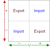 Such a curve is exceptionally useful as it not only indicates linearity, but at what times the load may be importing and/or exporting energy i.e. the presence of a reactive component to the current curve.
 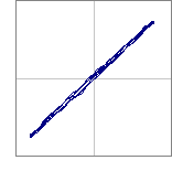 The definition of a linear load clearly defines such a load as one whose current curve follows the voltage curve exactly. Based on this, if the load was truly linear, the XY pattern will be a straight line (the angle depending on the current).
 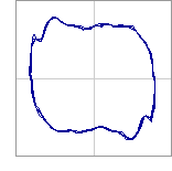 Although there is a tendency towards an oval/circle (which would occur in a perfect sinewave world), the actual plot shows a clear 'squaring' from the flat-topping of the input voltage.
 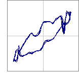 Here is the plot of a sodium lamp. Although the tendency is toward a straight line i.e. linear, there are two interesting 'blips' near the ends of the plot. Also note these "double back" i.e. the current is reversing rather than increasing at this point.
 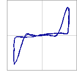 This plot clearly shows the load only conducts (Y axis) towards the outer extremes of the voltage curve (X axis).
 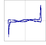 Not quite your incandescent lighting resistive load!
 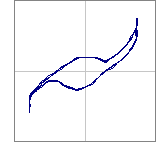 Taken with a 1kW output microwave oven with the magnetron at full output (filament completely warmed). Until the filament is warmed, the XY plot resembles that of a hi-tech load as shown above.
  As you can notice, the graph is blank - I have not found anyone who will rise to the challenge of having their active harmonic filter tested with this method!